The
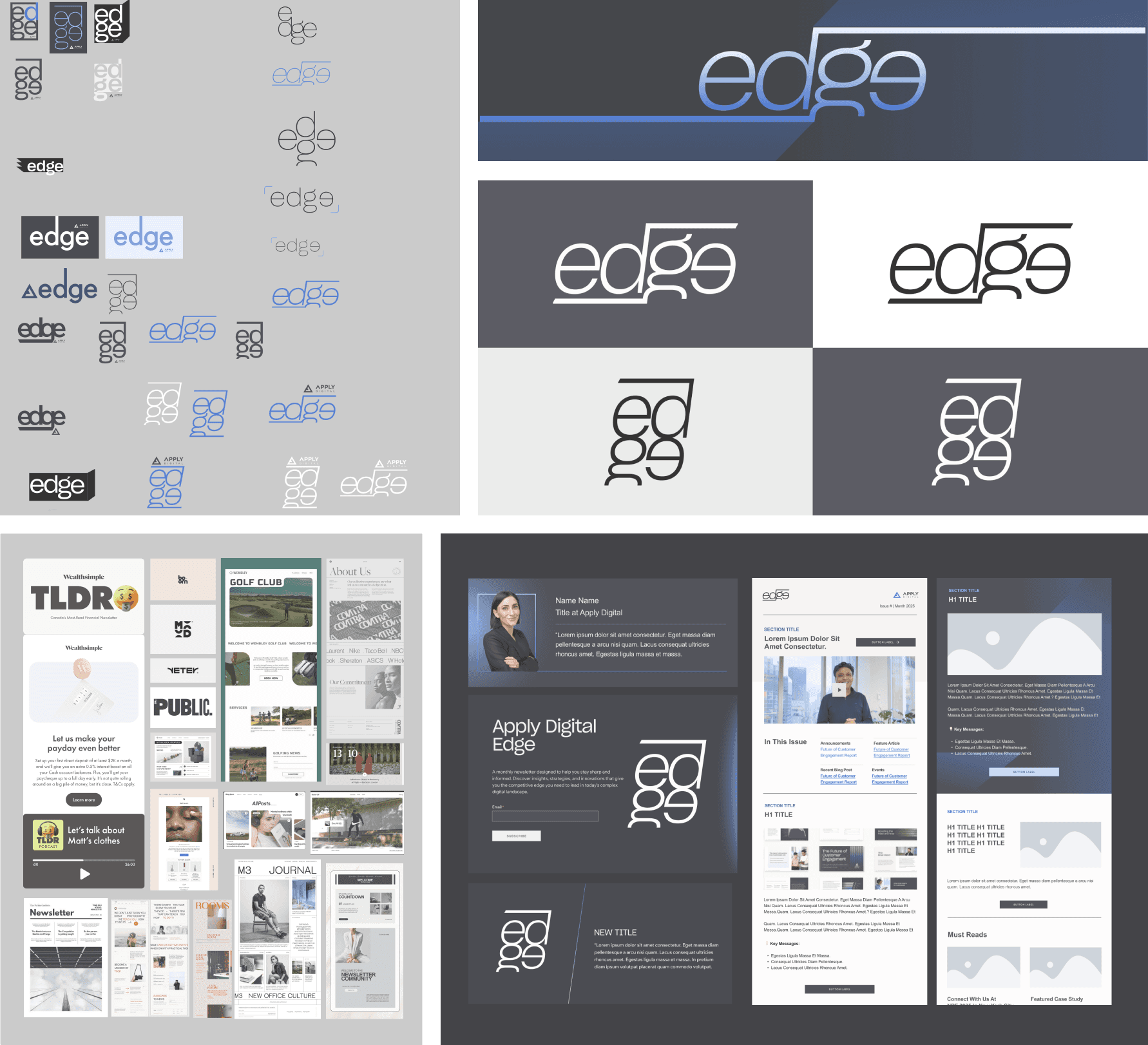
edge
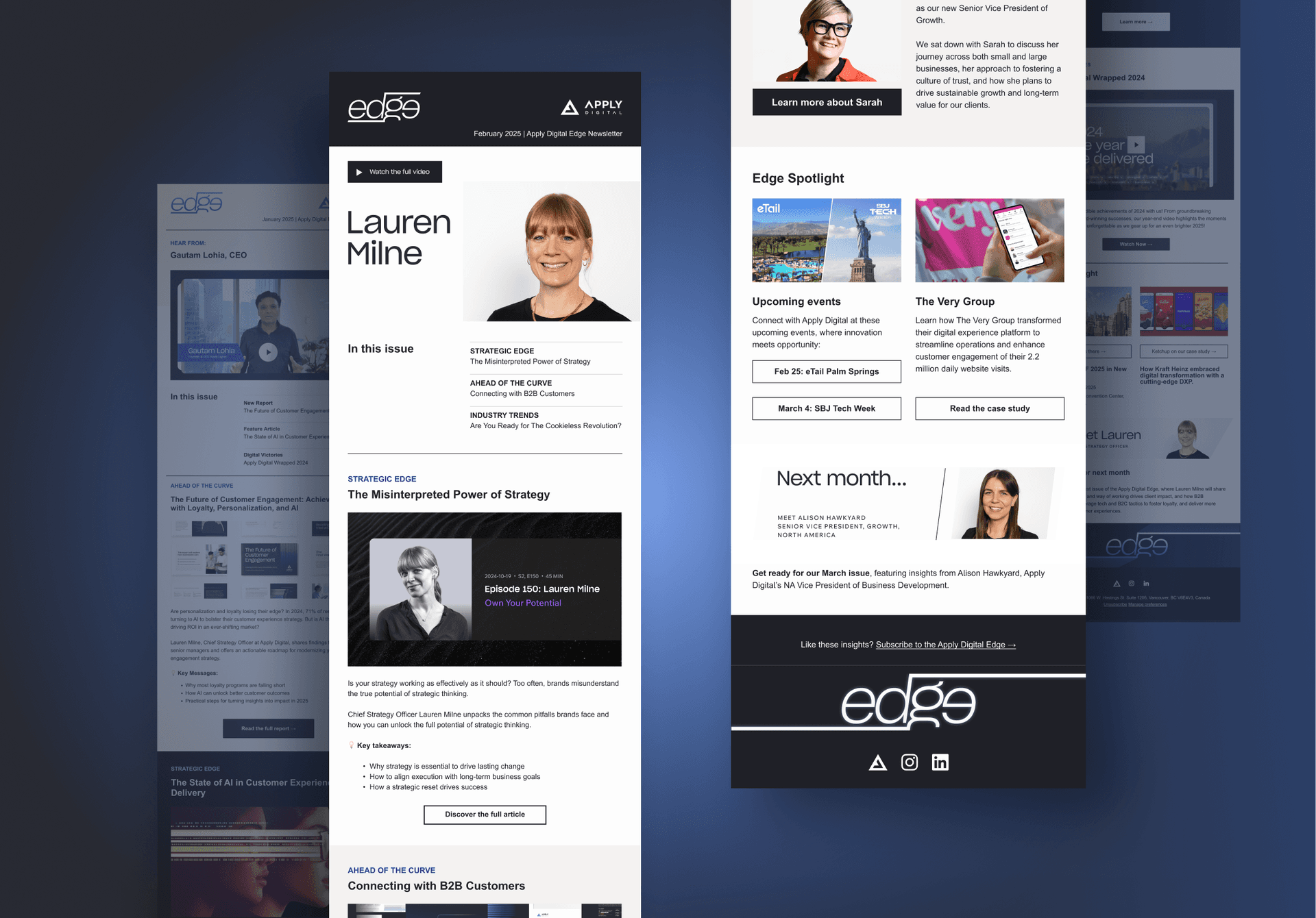
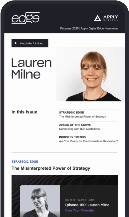
The Edge is a monthly newsletter that offers the latest updates, news and thought leadership from Apply Digital (AD). While the Edge as a sub-brand to AD should maintain the parent branding’s aesthetics, its independent identity is important to differentiate themselves from its competitors. With a strong, visually striking design, it expanded Apply Digital's exposure and positions the company as an expert of the tech field.
The team and I started the brand development process by defining the Edge as these key attributes: Empowered, Unique, Confident, Guided Journey, and Visionary. Initially, the blue-coloured glow was highly considered to represent the tech nature of the content. However, guided by the above attributes, the newsletter branding eventually settled with using AD's branded black and white tone. Not only does it express Apply's expertise, the minimum colouring also gives more design freedom to the highlighted content to shine.
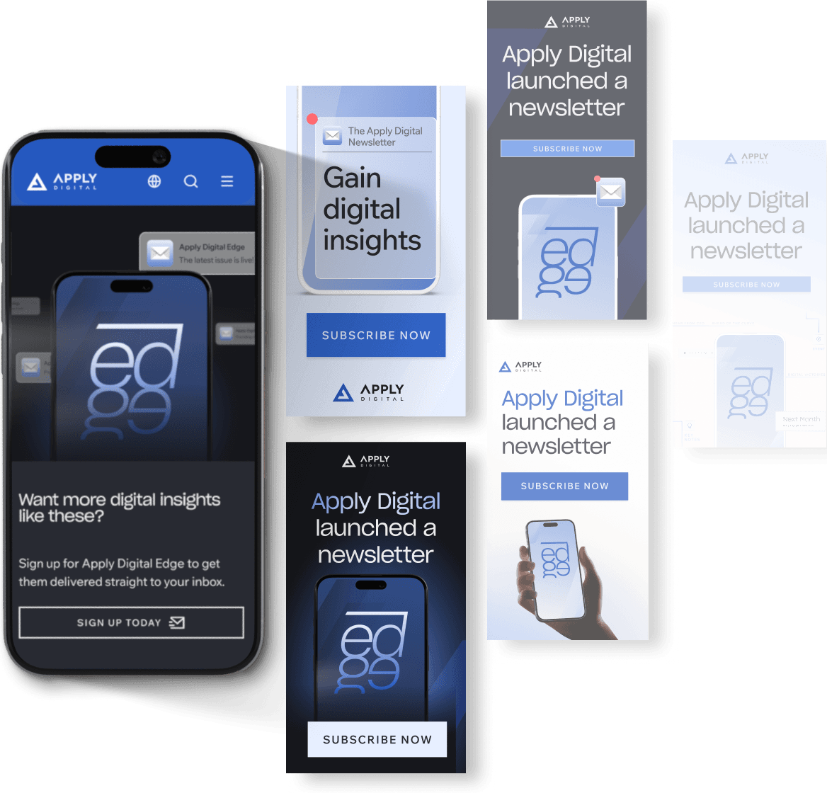
Beyond the newsletter, the campaign extended the branding to the website call-to-action (CTA) and a set of Account-Based Marketing (ABM) ads.
To attract attention and connect with new audiences, the assets utilized a range of blue colors designed to contrast effectively with both light and dark backgrounds. Complementing different taglines and messages, I used various design concepts: some featured dramatic glowing light effects, while others had a human touch to represent the users.
This effort was highly collaborative—involving brainstorming with the Email Specialist, adjusting messages with copywriters, and tweaking designs based on feedback from the campaign coordinator. This teamwork eventually paid off, resulting in positive growth for the campaign.