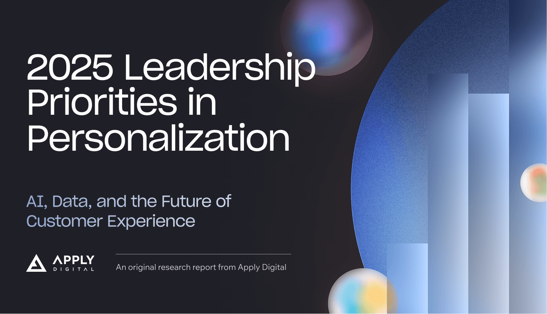
Personalization Report 2025:
AI, Data, and the Future of Customer Experience


Reports are one of the long-form content that offers dive deep discussions of current trendy topics. In this report, the tech leaders give insights into the surge of AI use in digital platform, supported with comprehensive statistics, case studies and researches. From design perspective, we also elevated design by learning and using new tools, such as: incorporating AI in brainstorming stage, utilizing colours and motifs to convey emotions, and studying deeper about data design, introducing the Apply Digital brand to a new elements.
design development
initial design direction
colour design suggested by AI
- Bright azure blue transitioning to soft violet - Representing optimism about AI advancement while acknowledging thoughtful consideration of privacy concerns
- Deep purple merging with electric blue - Capturing both the "sublime" feelingand slight "vertigo" described in this section
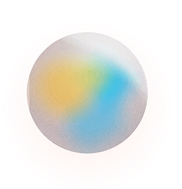
- Amber transitioning to steel blue - Reflecting the balance between consumer enthusiasm (61% willing to share data) and their privacy concerns
- Vibrant emerald green brightening to gold - Representing growth and investment highlighting the 82% of leaders increasing personalization spending
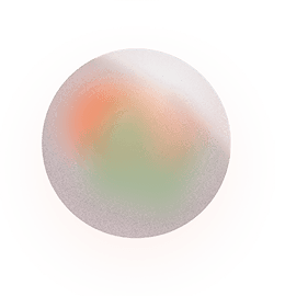
- Deep coral softening to sage green - Acknowledging difficulties while showing path to solutions
- Harmonious blend of deep blue and soft gold Symbolizing the balanced perspective between opportunity and responsibility
Executive Summary
Conveys a sense of anticipation and optimism about AI-driven personalization, while acknowledging some uncertainty about privacy concerns.
Unpacking the Personalization Landscape
Evokes a mix of wonder and slight disorientation - describing personalization as both "sublime" and potentially inducing "vertigo" in consumers, leaving them between "fulfilled and baffled".
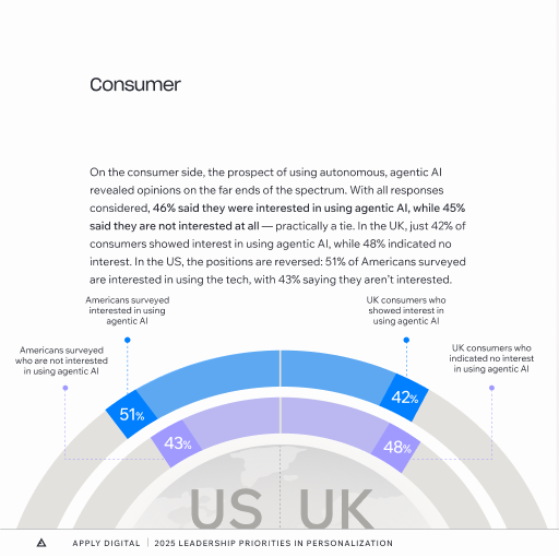
Consumer Expectations
Projects tension between desire and caution - while consumers show enthusiasm for personalization, there's underlying anxiety about data privacy and security.
Rise of AI-Powered Personalization
Conveys excitement and momentum, with businesses showing strong confidence in AI investments.
Challenges
Expresses concern and pragmatism about technical limitations and implementation hurdles.
Final Word
Concludes with a sense of balanced optimism - acknowledging both the opportunities and responsibilities in the future of personalization.
These emotional themes could be represented through your orb motif by transitioning between colors that reflect these feelings - perhaps moving from bright, optimistic tones through more complex, nuanced shades, and ending with balanced, harmonious colors that represent the synthesis of opportunities and challenges.
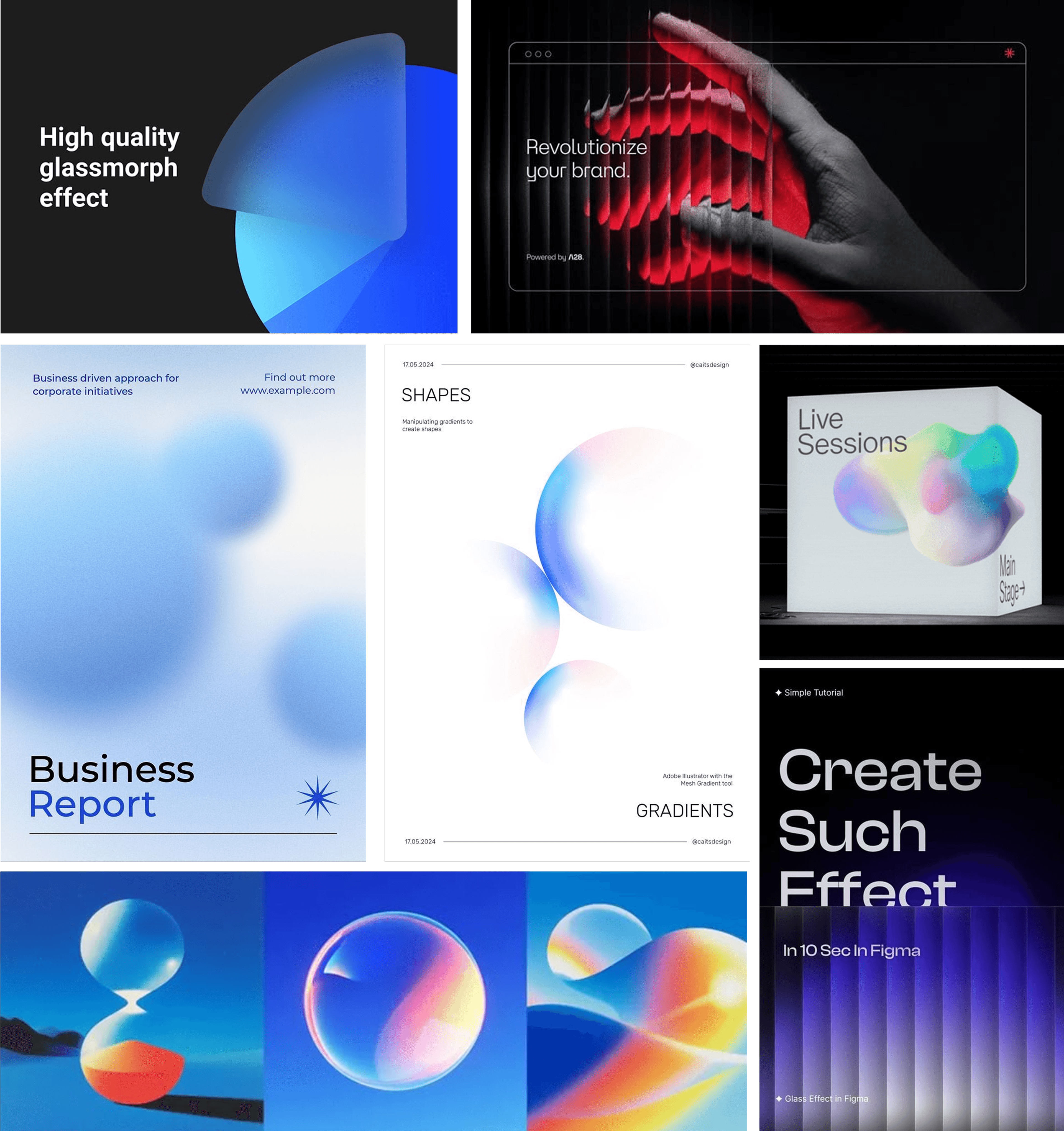
During the initial design exploration, I was inspired by the idea of using morphic, colourful spheres. This visual fluidity directly mirrored the subject matter—AI—which currently has a significant technological debate. I also incorporated a glass effect, introducing a sense of unclarity, visually linking the design back to the fundamental tension that the report is tackling about AI.
To solidify our design directions, the team and I utilized AI tools, such as Gemini and ChatGPT, to create the report’s colour schemes. We prompted AI to analyze the report's themes and suggest distinctive colour combinations that might represent particular points of view and its associated emotions (e.g., trust, concerns, enthusiasm etc ). We then used the AI's analysis as our starting point, and modified the best fitting options to the report's narrative, as well as the brand identity.
Eventually, the conceptual work led us to our final four distinct coloured orbs With the first blue orb carrying the Apply Digital’s brand colour, establishing immediate brand recognition in the opening and closing sections. Then, a Purple-Blue Orb represented AI advancement. A Yellow-Blue orb conveyed the tension of AI enthusiasm and concerns. And lastly, the Orange-Green orb acknowledged the future difficulties and challenges in AI development .
This initial research and brainstorming stage critically defined the design direction for the entire report. Not only it extended the company's established branding, but more importantly, created a clear, unified visual guideline for each chapter. The foundational colour guideline ensured all following graphic elements and imagery across the report remained consistent, cohesive, and easily attributable to its specific thematic section.
final orbs and motifs
Orbs represent consumer throughout the report. Colours represent the emotions being explored during each section.


These blurred shutters ("tech stacks") represent business throughout the report.
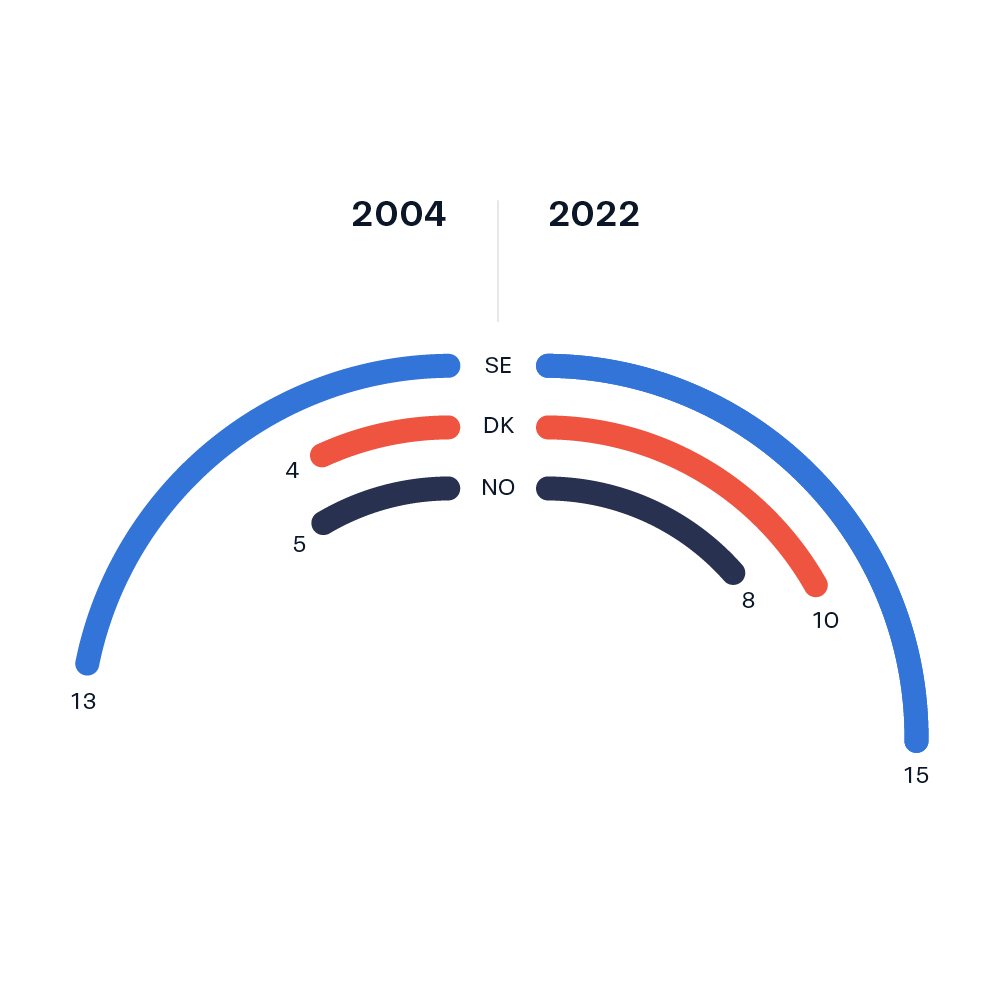
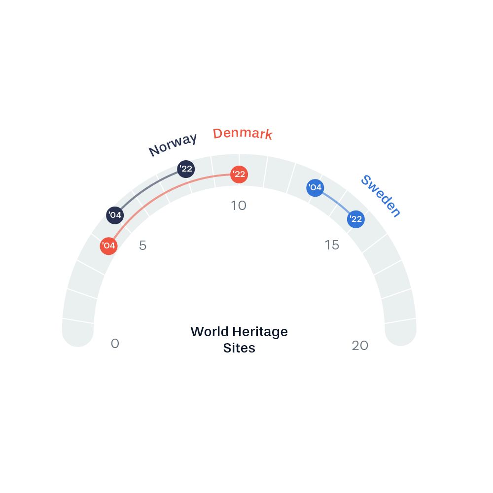
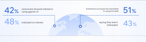
Another main highlights of this report is the thorough researched datas. A challenge for us designers is to transform complex quantitative data into scannable, digestible infographics while maintaining readability.
To achieve such goal, I took initiative to research and learning on data and infographics through different channels: I had to first familiarize myself about characteristics of different data charts; then, I talked to experienced senior data designers for feedbacks; Lastly, I proactively look for inspirational examples like Data Viz Project , to widen my knowledge on the varieties of data visuals.
This side-research is an invaluable opportunity to expand my design skills. Through learning about Data Design as a problem-solving mindset, I now take extra preparation to ensure the raw data can be efficiently translated to easily understandable graphics at a glance. The teamwork and investment have contributed to the success, receiving positive responses from Subject Matter Experts, and the new design elements were adopted into other media projects.
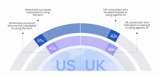
data infographic research / inspiration
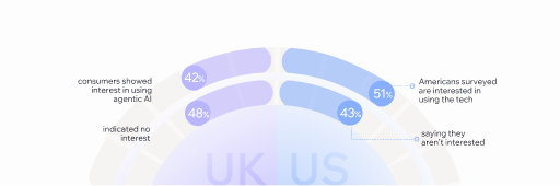
draft 1
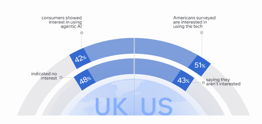
draft 2